Nutters Everyday Naturals is a health and wellness retailer with 25 locations across western Canada.
Nutters monthly flyer design has undergone changes year after year as the company's brand identity has continued to evolve over time. This flyer redesign was proposed to mimic the visuals being utilized in other marketing channels and reinforce the visual identity of a Nutters flyer.
2024 Flyer Design Mock-Up
Sale Signage
Starting in 2023 many of the brand's marketing visuals had begun to shift away from the primary Nutters Red and explore the use of the mossy earth toned green. The earthy green was more fitting for a company that was committed to providing customers with a variety of natural and organic products.
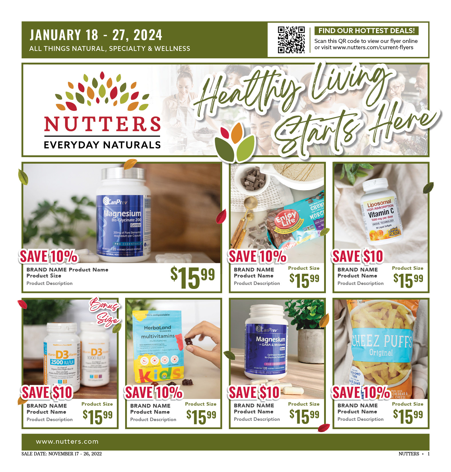
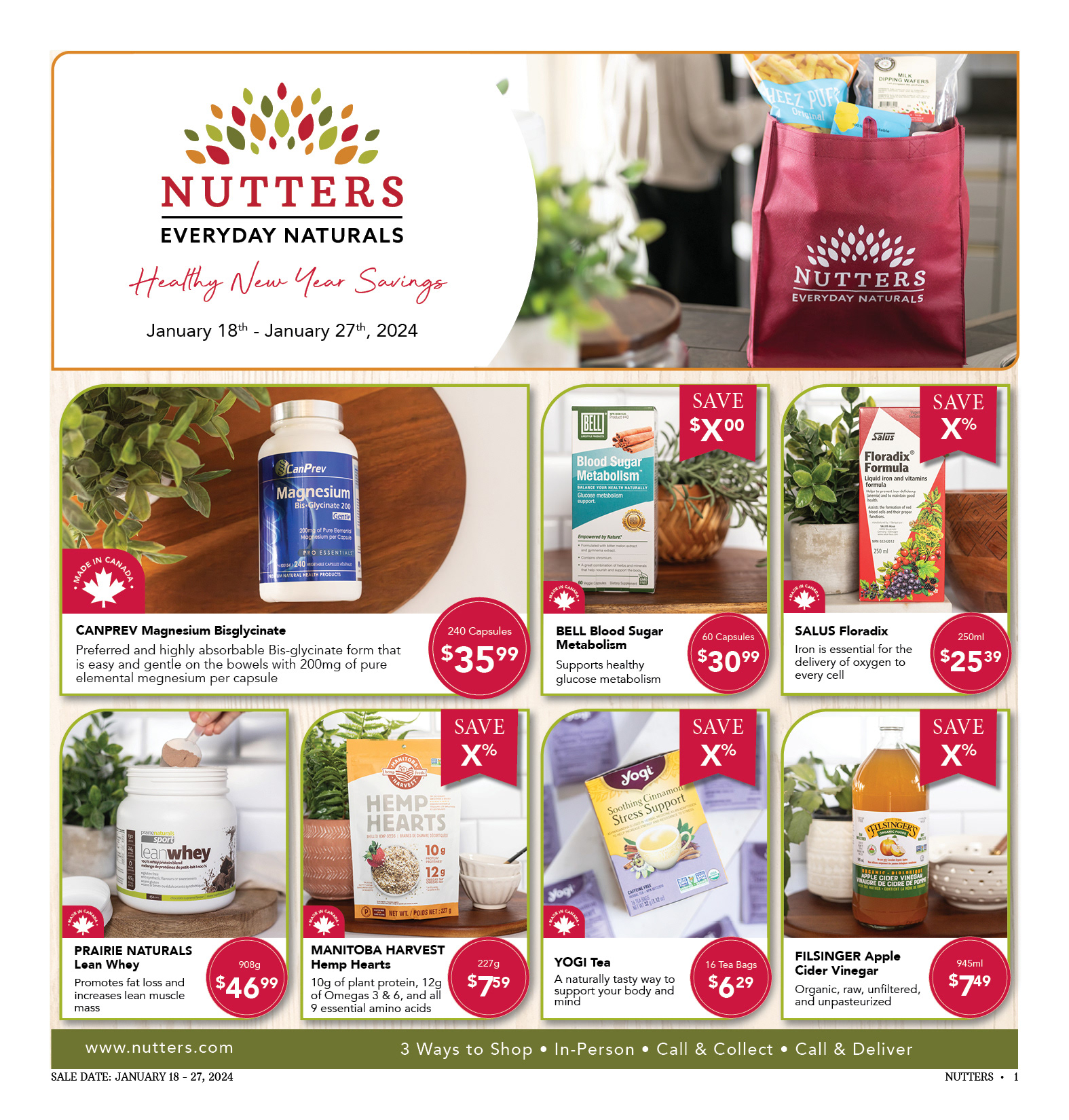
2024 Front Cover
2023 Front Cover
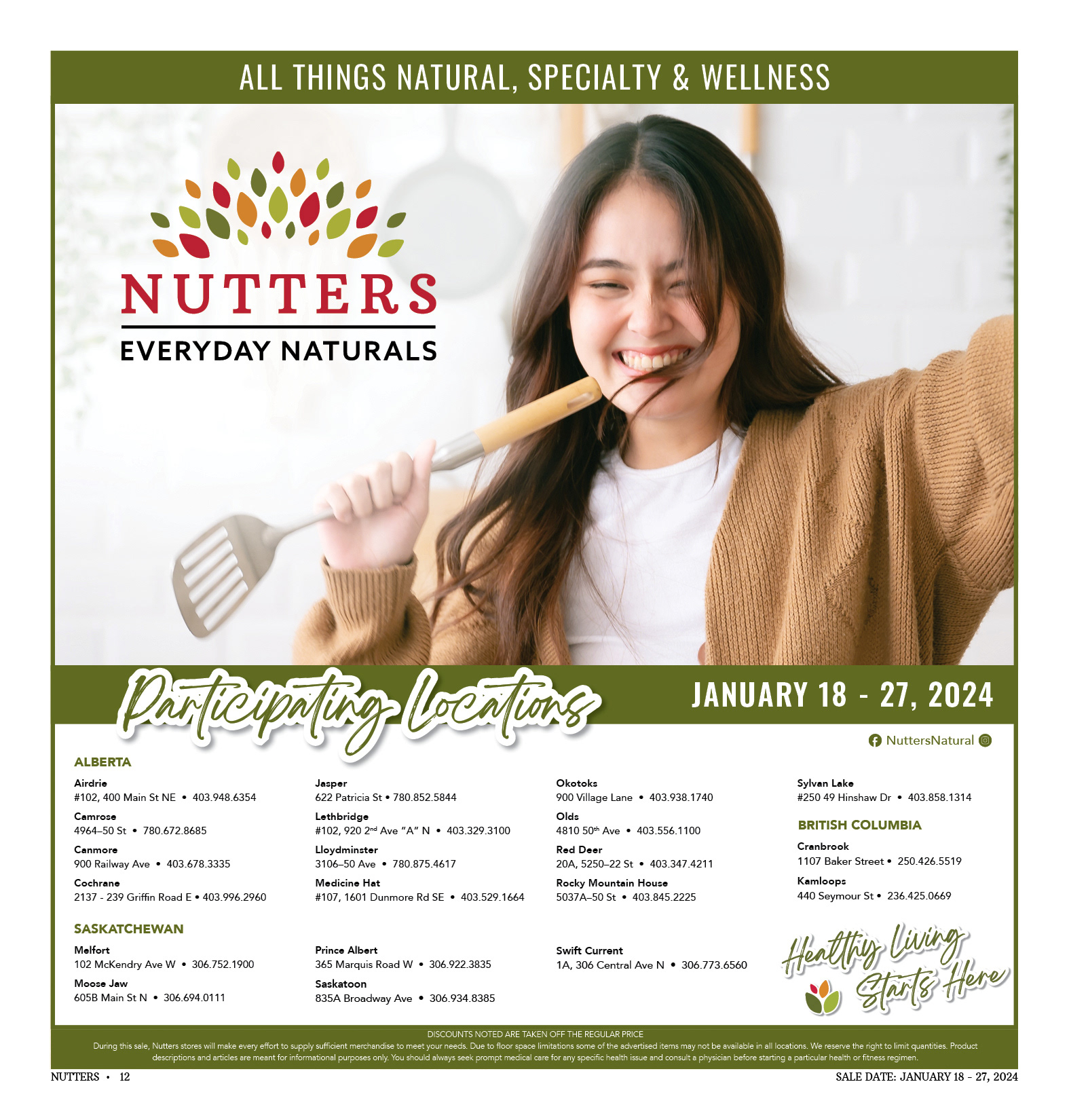
2024 Back Page
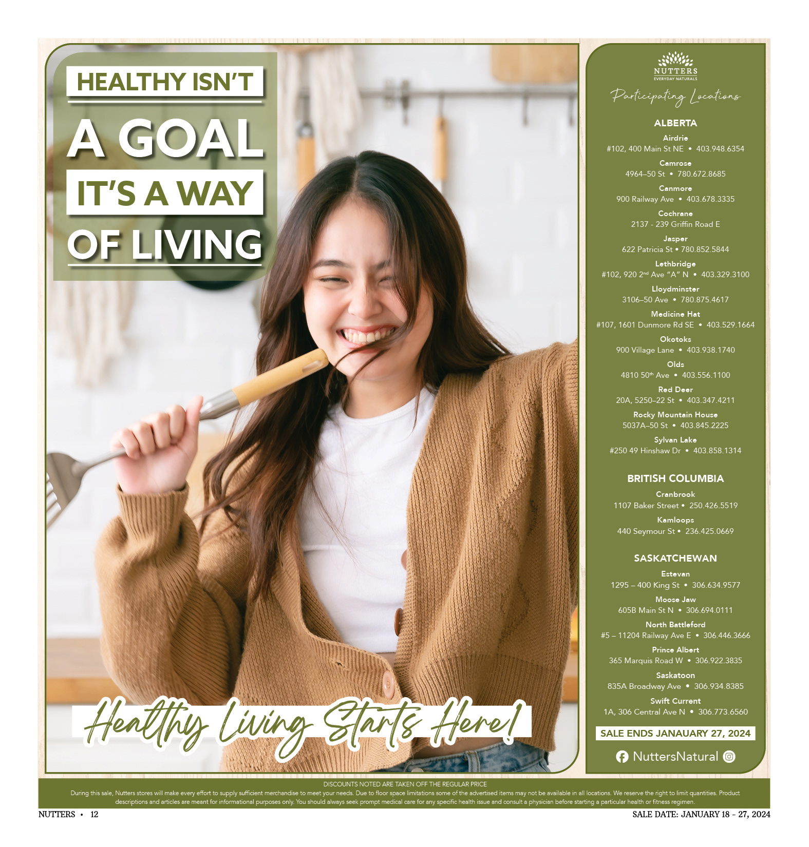
2023 Cover Page
Above are side by side comparisons of the front and back page of the 2024 redesign and the 2023 design.
On the original design's front cover, the sale dates were not prominent enough. By placing the dates in the top left it is much easier for potential customers to identify when the sale will take place as well as what kind of items can be found within the flyer. The original design's back page had a similar flaw, the sale dates were not very prominent and neither were the participating locations.
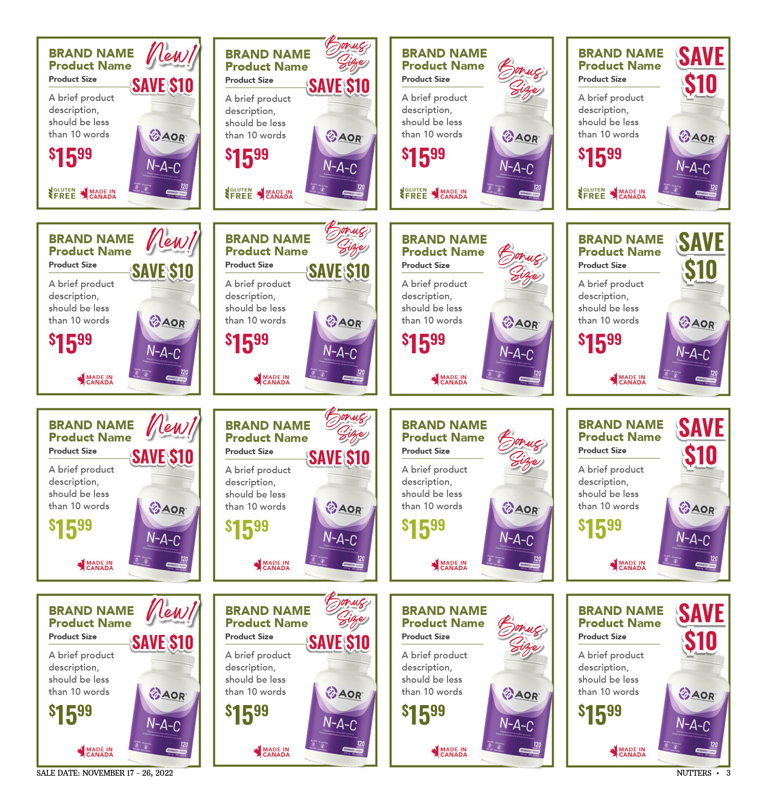
Interior Page Colour Test - Design 1
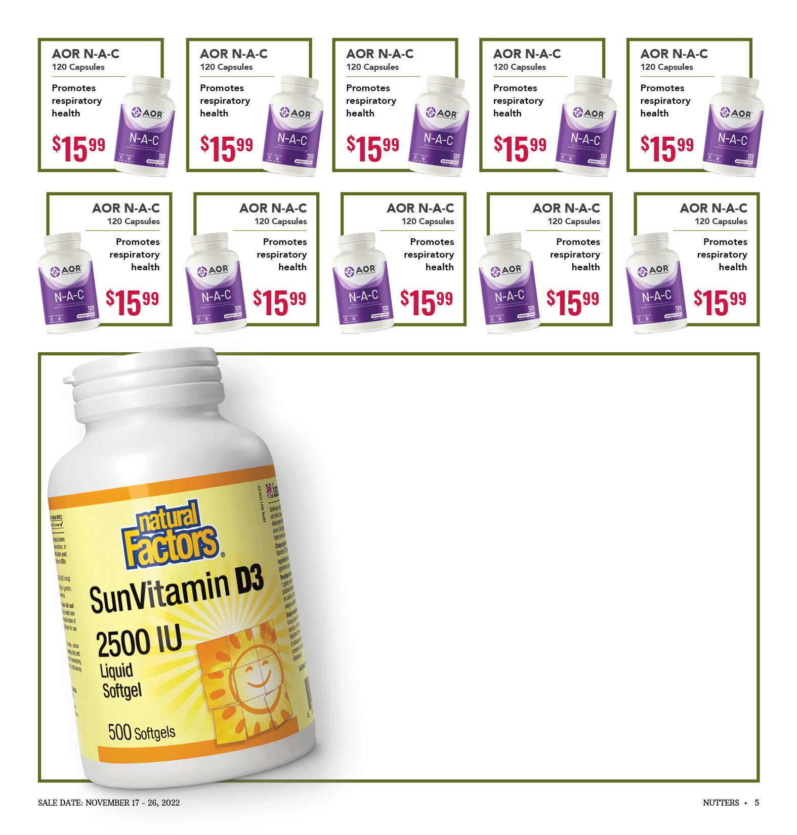
Interior Page Layout - Design 1
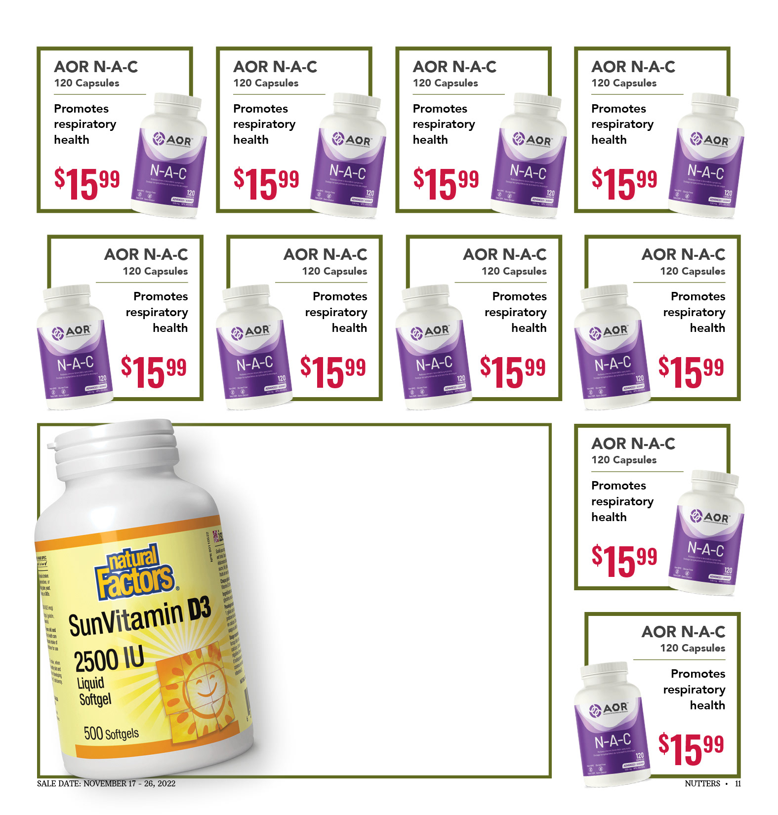
Interior Page Layout
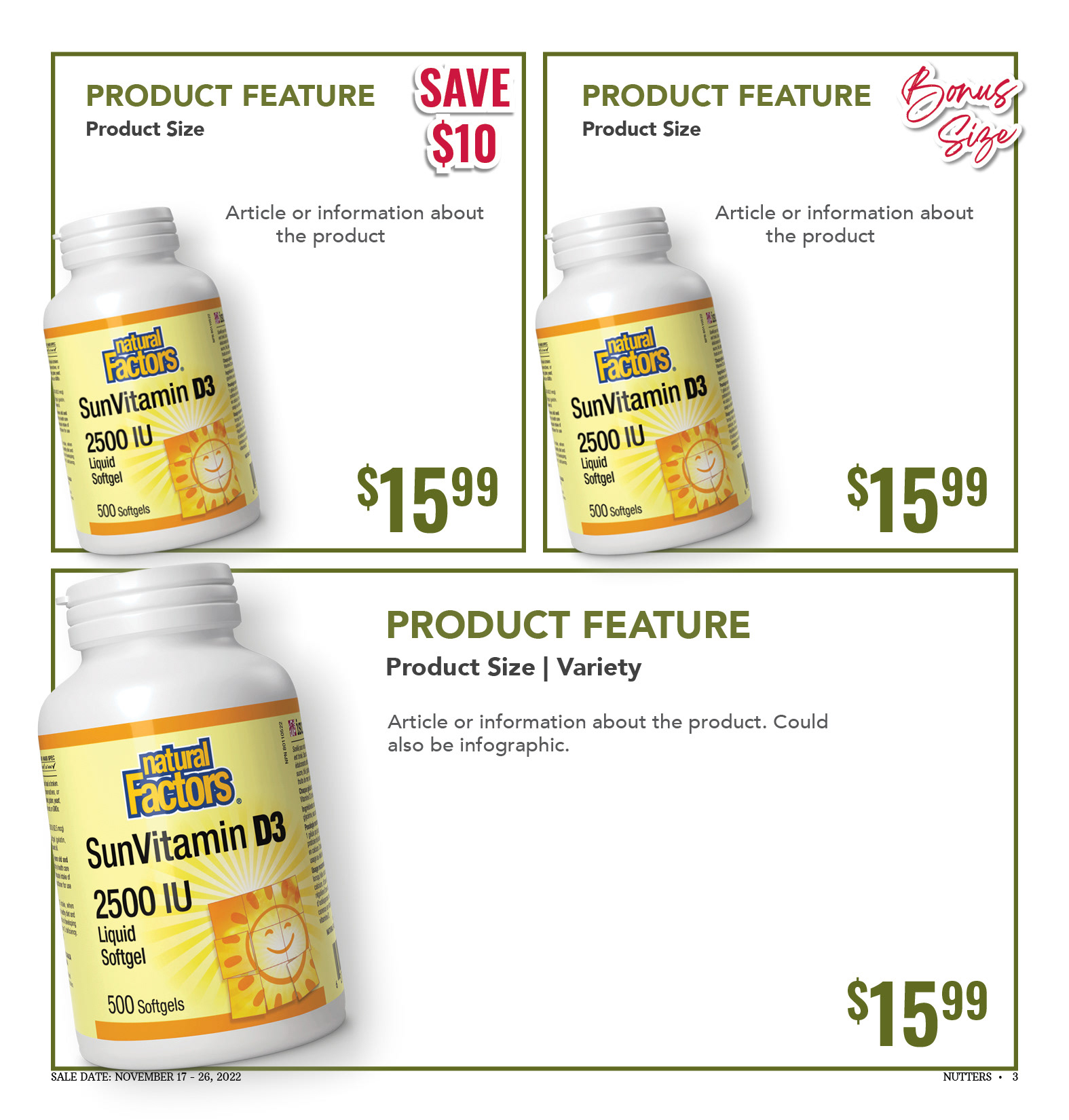
Featured Product Spaces
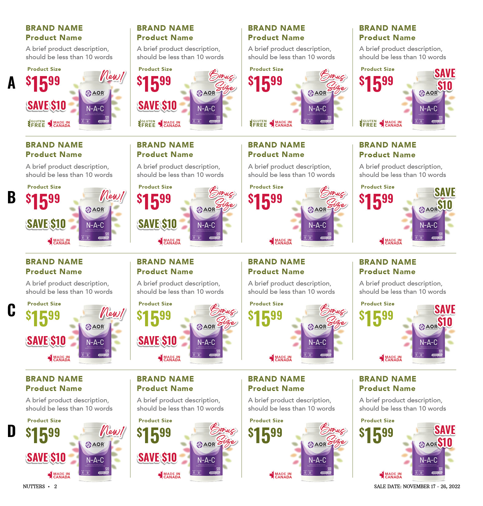
Interior Page Colour Test - Design 2
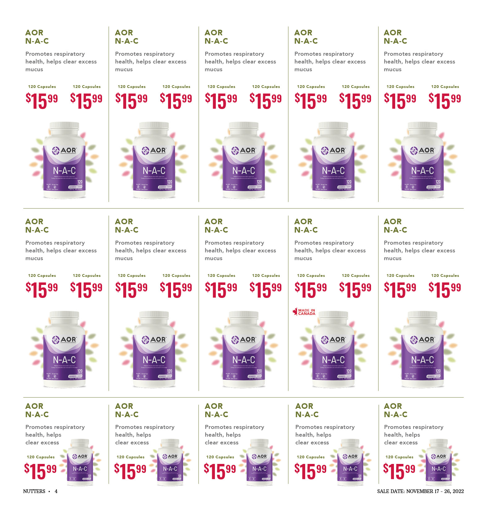
Interior Page Layout - Design 2
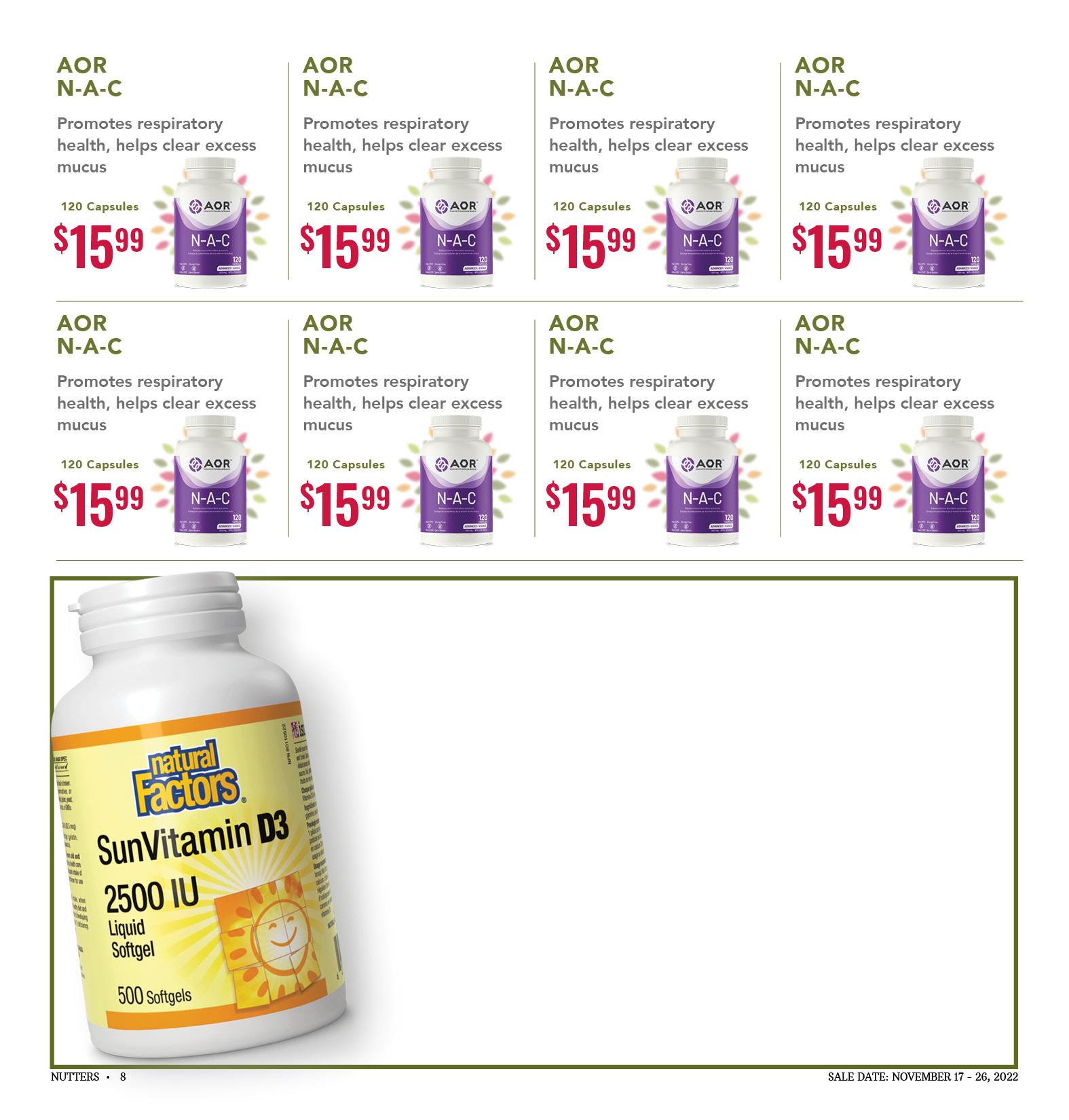
Interior Page Layout - Design 2
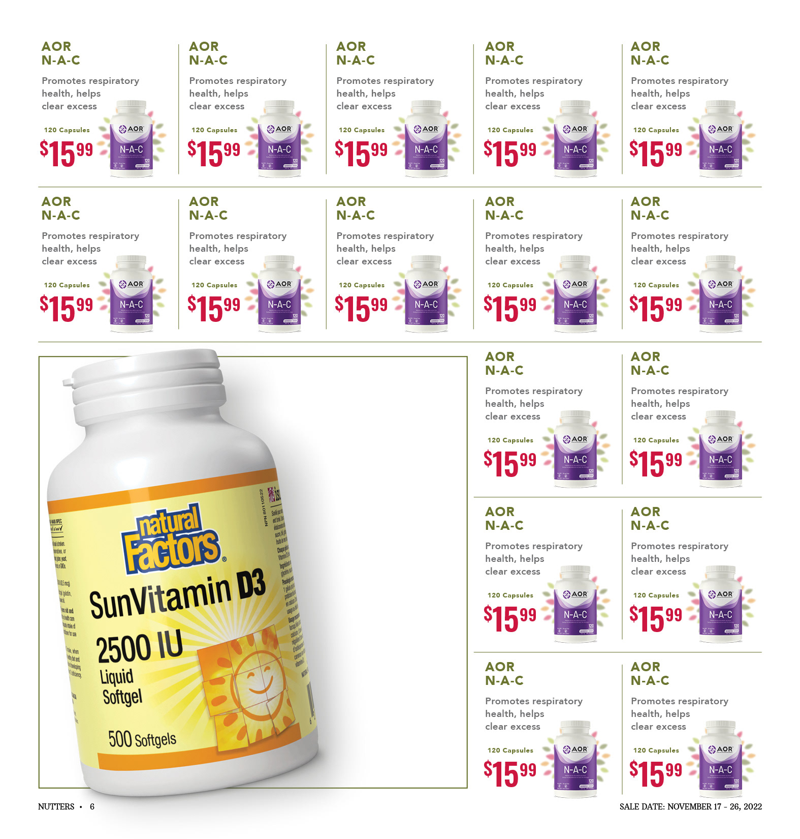
Interior Page Layout - Design 2
For the 2024 redesign, I worked on a variety of interior page layouts. I explored different variations including colour and sale information placement. I found that the Nutters Red was still the best choice for pricing and discounts as it stood out on the page. Customers were also already accustomed to the red flyer pricing for discounts and price.
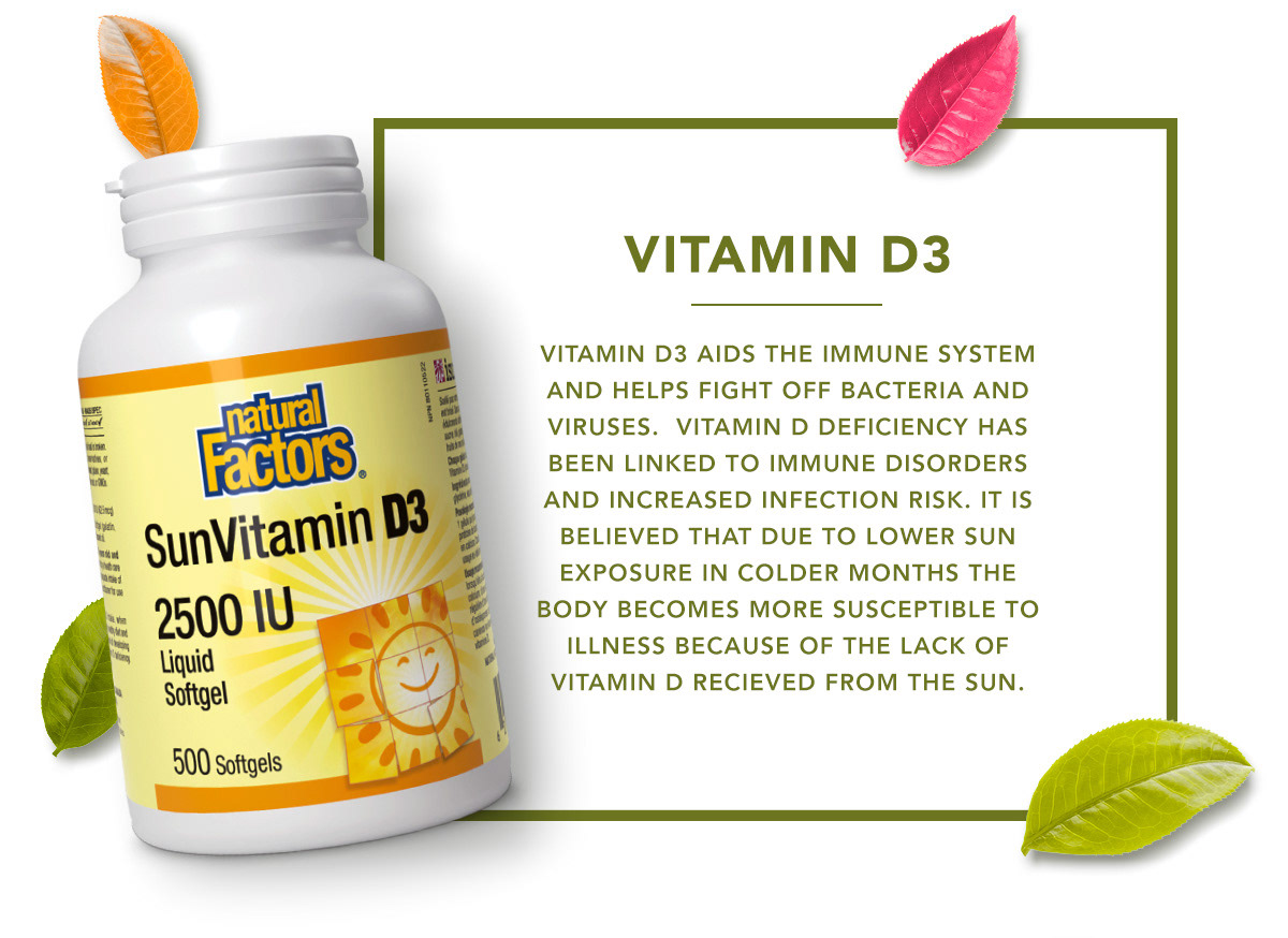


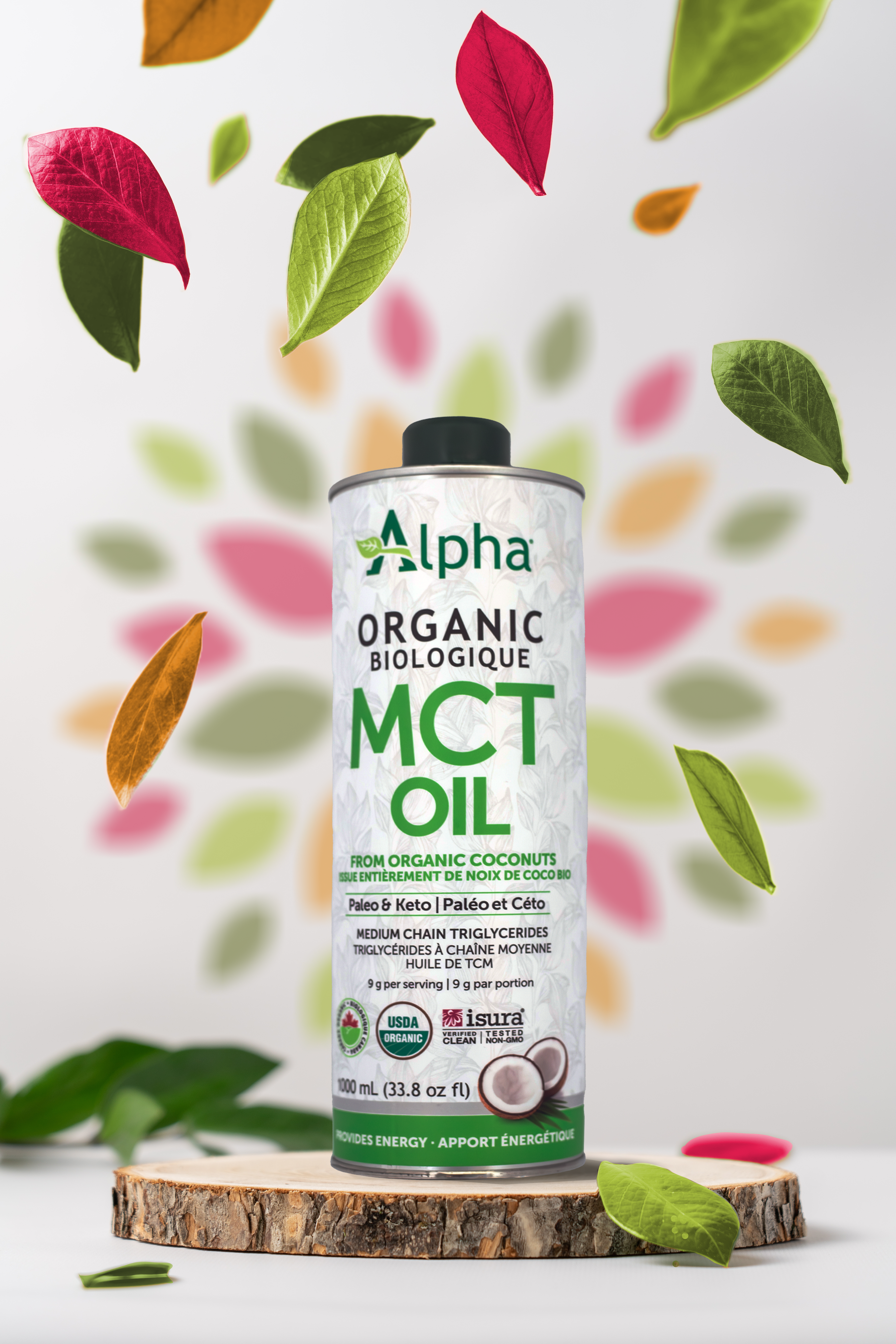
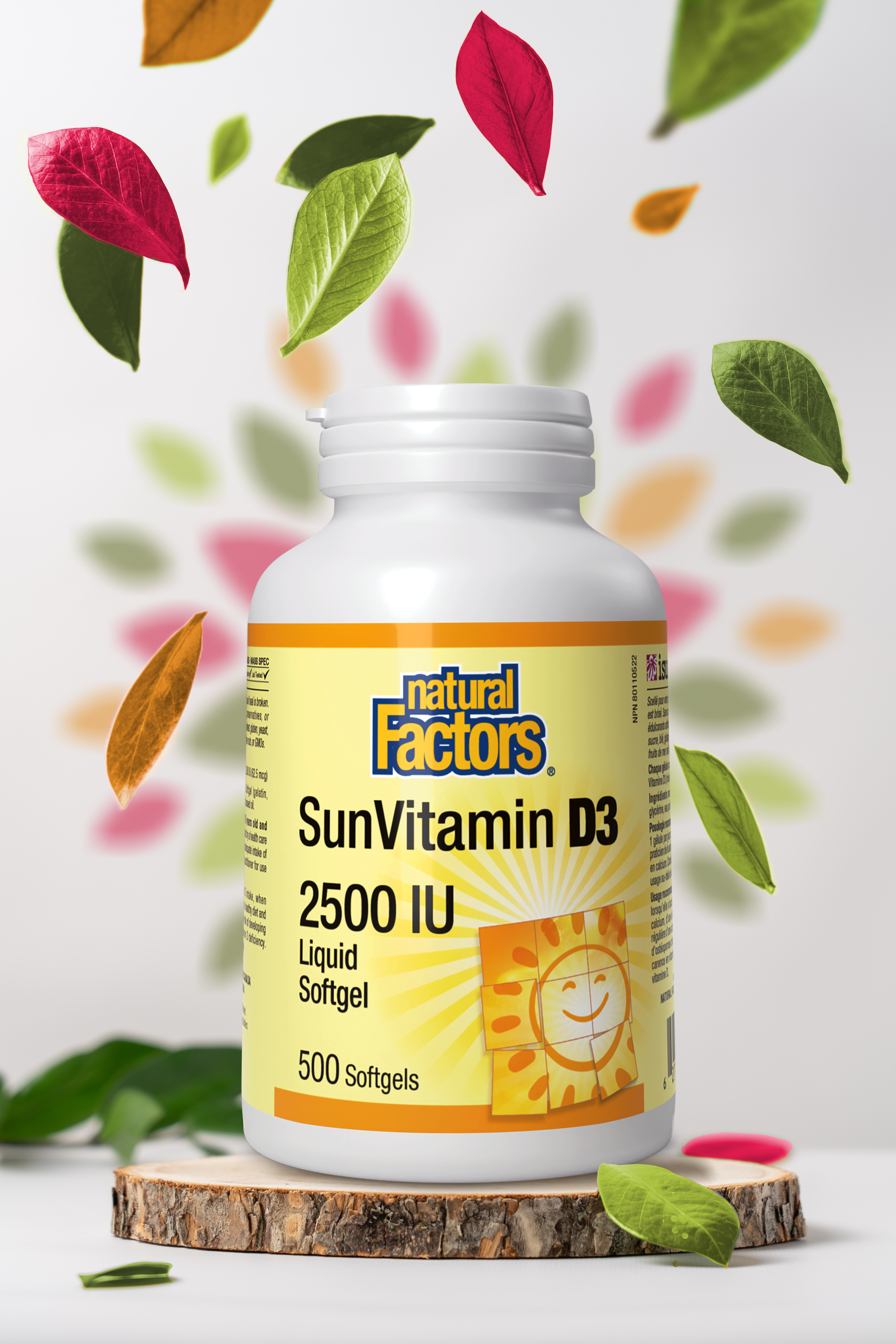
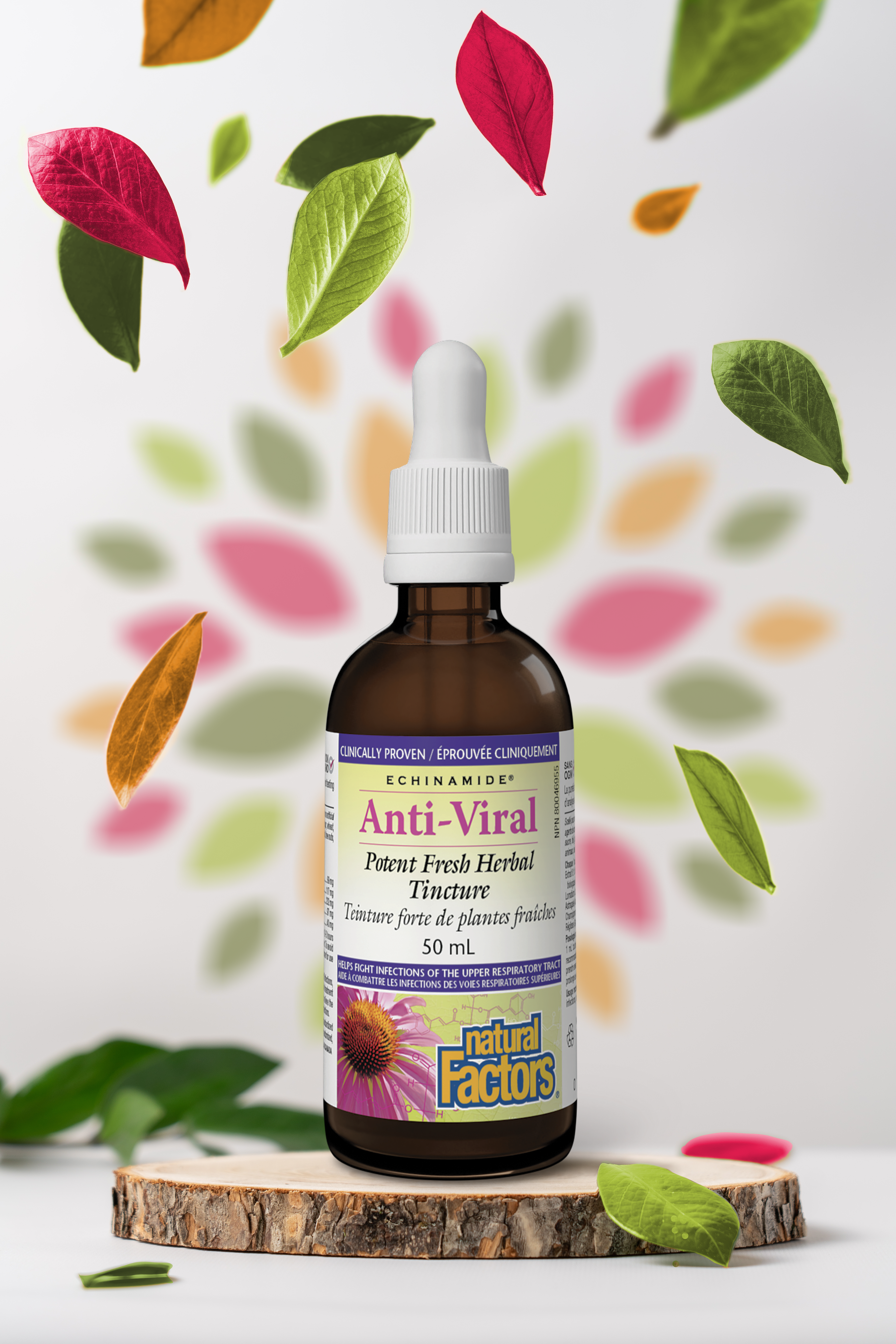
Specific products were often selected for larger ad spaces each month. Most of these ad spaces would use visuals provided by the product brands, however in 2024 I wanted to experiment with making these product promotions more Nutters branded. By doing so, Nutters wouldn't have to rely on the same visuals used at competing retailers to entice customers to come in and shop at their store.
